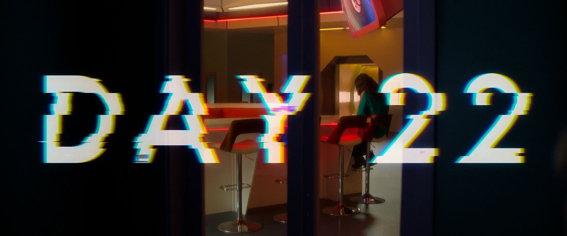
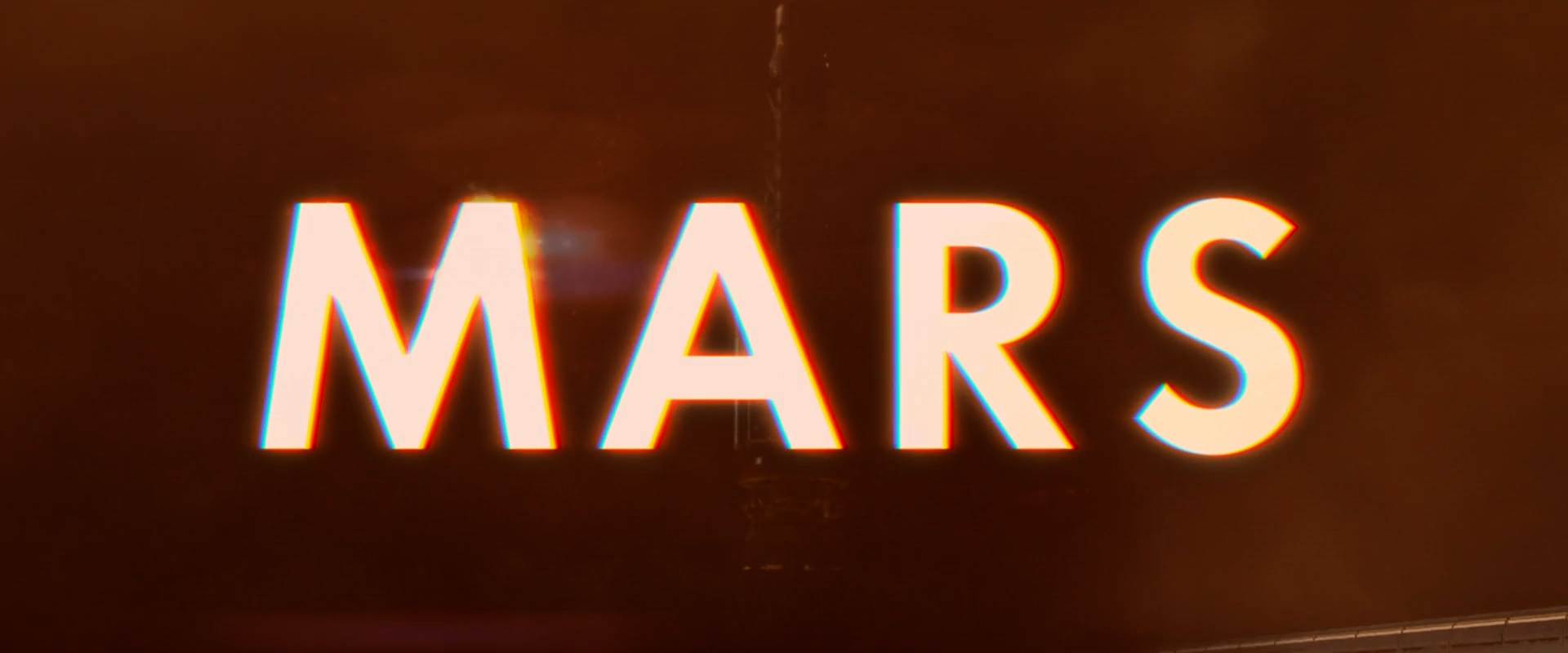
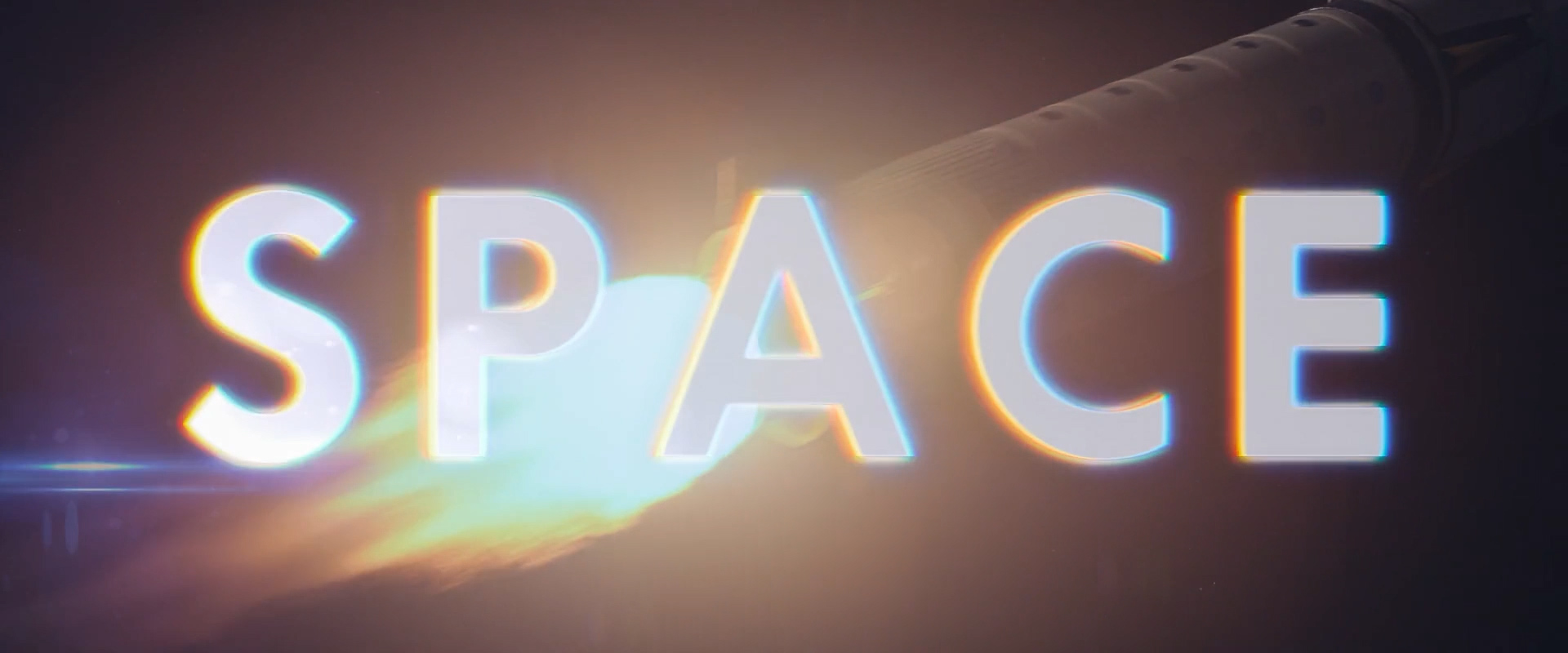
Title Designs
This film required comically large title cards to portray the passage of time. As time passes, we see each graphic become increasingly glitchy and damaged, mirroring the frustration that the main characters go through in the story. Additionally, the design for the opening credit names were designed with the same glitchy effect. The effect had to be “just right” in order to not impede on the actors’ performances.
Moonshot trailer


